Showing posts with label posters. Show all posts

30 October 2022

The Pain of Others: a short review essay on Somnath Hore

Somnath Hore was a great artist of collective hope and hardship, but his abiding legacy is to make us feel each human tragedy as our own.

(My India Today review of a Somnath Hore retrospective 'Birth of a White Rose', held at the Kiran Nader Museum of Art in the summer of 2022. To see some images from the exhibition, click here.)


What makes someone become an artist? Somnath Hore, who would have been 101 this summer, was first moved to draw in December 1942 by a moment of violence: the Japanese bombing of a village called Patia in what is now Bangladesh. Hore was then a B.Sc. student at City College in Calcutta, but World War II evacuation had forced him to return to his Chittagong home. The ghastly sight of Patia’s dead and wounded seemed to demand recording in some way, and it was images to which the young man turned.

In Calcutta, he had begun to design posters for the Communist Party, but it was Chittagong that really put Hore on his political and artistic path. Two things happened in 1943: the Bengal famine began, and Hore met Chittaprosad. Six years Hore’s senior and also from Chittagong, Chittaprosad was already a prolific artist documenting the lives of Bengal’s rural poor. As a man-made colonial tragedy killed millions around them, Chittaprosad encouraged Hore to draw portraits of the hungry, sick and dying. “From morning to evening I used to accompany him on his rounds,” Hore wrote later. “He initiated me into directly sketching the people I saw on streets and hospitals.”

In 1945, Hore enrolled for formal art training at the Government College of Art and Craft. In 1946, the Communist party sent him off to Tebhaga in North Bengal, where he created a diary-like documentation of the massive peasant protests. It was a tumultuous decade, moving between politics and art while having to make a living by teaching school students art. When the government again banned the Communist party, he went underground. It was not until 1957-58 that Hore got his diploma, and left Calcutta and politics to become a lecturer at the future Delhi College of Art.

The show at Delhi’s Kiran Nadar Museum of Art is superb; its gravitas undimmed by ill-advised curatorial versifying: sample “He witnessed as a child a world not so fair,/ Disparities between rich and poor had no compare....” 

It’s clear that Hore experimented with form and material through his six decades of art-making. It’s also clear how much his lifelong sensibility was sculpted by the tragic events of his youth. Over and over, you see him depict the suffering human body. Until the 1950s, he also depicts the magical charge of hope produced when these same bodies come together—to plant seeds, flags, ideas. But the stunning realism of the early woodcuts and linocuts gives way to abstraction, and a greater economy of the line. His figures are all concave stomachs, stick-like limbs and begging hands. 

They transition into the jagged, torn, blistered bodies of his bronze phase (animals, too, show effects of violence), and an almost meditative late style, using pulped paper. Here the lacerated body is conceived as texture rather than as line: white on white, paper scored, torn and moulded back into paper. The pain of others remained, forever, under his skin.  

(Birth of a White Rose is on at the Kiran Nadar Museum of Art, Delhi, until June 30, 2022.

25 November 2015

The World as Picture: Book Review

A book review published in Biblio's Sep-Nov 2015 issue:


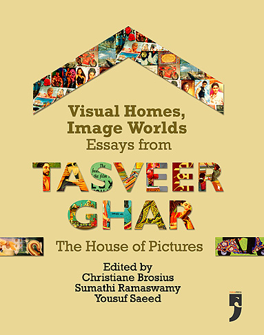
Visual Homes, Image Worlds: Essays from Tasveer Ghar -- The House of Pictures
Ed. Christiane Brosius, Sumathy Ramaswamy 
and Yousuf Saeed.

Yoda Press, 2015.

Allow me to start this review with a triptych of images — since Tasveer Ghar, as the name suggests, is all about pictures. An online database initiated in 2006 for collecting, digitising, and documenting the popular visual culture of South Asia, Tasveer Ghar has generated exciting conversations among scholars and arts practitioners, around the social, political and performative lives of images. The beautifully produced Visual Homes, Image Worlds is a collection of essays generated by the Tasveer Ghar network (and first published online).

The images I want to discuss appear in different essays in the book. But to me they seemed to speak to each other across the pages. The first picture is the frontispiece of Richard H Davis’s superb, succinct essay on “God posters for and of worship”. It features a smiling sari-clad woman in side profile. Holding an aarti thaali, her head covered respectfully, she raises her eyes to something we cannot see. Beyond the scalloped window arch in which she is framed, a series of South Indian-style temple gopurams and coconut palms are silhouetted against the evening sky. The caption reads: ‘A Hindu Devotee Prays.

'A Hindu Devotee Prays' -- Calendar Poster, printed by Oriental Calendar Manufacturing, mid-20th century 
Davis points out that the Calcutta Art Studio, one of the first companies to issue chromolithographs of Hindu deities, swiftly realised that the Indian public wanted images of the gods, but “single prints... for worship, not bound volumes for leisurely perusal”. The recognition led commercial publishers and companies to produce calendars, posters and other visual material that could cater to this demand. But slowly, as Davis shows, images produced for worship were joined by images of worship. The incipient form of these was the Lakshmi or Ganesh with a plate of prasad and/or lit diyas painted at their feet, thus incorporating the intended puja samagri (items used for worship) into the image itself. The image I’ve described could be said to be a more advanced version, where not just the puja samagri, but the worshipper is mirrored within the image. In this particular poster, there is no deity at all. But there is a temple, and a human devotee who contemplates the divine. 


The second picture I want to point out seems to me to echo the first in some ways, and differs from it in others. The first image was dated mid- 20th century, while this dates to the late 19th or early 20th century. It is a beautifully illustrated textile label, included in Catherine B Asher’s article “Fantasizing the Mughals and Popular Perceptions of the Taj Mahal”. Here, too, there is a human figure in the left foreground, framed within an arch and looking out into the distance. The object of contemplation here is the Taj and its reflection, not a deity or a temple. The young man stands with his back to us, wearing a kurta and dhoti, as well as a fetching red turban and a red sash around his waist. Asher describes him as “overwhelmed by the building’s significance, or perhaps smitten with love”. There is no obvious religiosity here, but the old mendicant in red robes, seated to the right of the image, may be said to provide a hint of the spiritual.

The third image dates to the present day: 2010, to be precise. It is a ‘beautification mural’ on Chennai’s Anna Salai, made by the artist JP Krishna, and reproduced as part of Roos Gerritsen’s essay on the gradual replacement of political and film hoardings along the city’s major arteries by murals meant to signify “Tamil culture and heritage”. On the right hand side are two Mamallapuram temples, their stone carved outlines reproduced in almost photographic detail. On the left, again with their backs to us, are two figures admiring the grandeur of the buildings. Like the woman in the first image and the young man in the second, these viewers stand in for us — the real-life viewers, standing outside the frame. And in this case, they’re tourists.

'Beautification' mural by artist JP Krishna, Chennai

These three images are drawn from three very different time periods, and for very different purposes — calendar art for Indian consumers, a commercial textile label to be sent abroad, and a street-side mural created by municipal fiat to project a new aspirational ‘global’ urbanity. And yet, in incorporating the viewer’s gaze into the image itself, I see these images as being very clearly in conversation. Looked at together they open up a whole range of thoughts about the aesthetics of looking: whether the contemplation of beauty is the same when the subject is perceived as divine, as spiritual, or as ‘world heritage’. At one level, it is a conversation that emerges from the old Benjaminian chestnut about the loss of aura, but in terms of these specific images, it could only have unfolded within the pages of this book.

And this is no accident. Through the essays here, popular visual culture in India emerges as an under-explored “bin of history”. Rummaging through it is both a way to produce an alternative archive, and challenge tightly-policed notions of genre. As the editors point out in their Introduction, the Tasveer Ghar archive is a place of cross-fertilisation. Indian images that were mass-produced, “be they greeting cards, god posters, patriotic prints, street art, advertisements or cinema hoardings”, journey through various sorts of worlds, and as they do so, “develop complex biographies and relations with other images”. Single images (or a constellation of them) often freely criss-cross any boundaries that might exist between public and private, ‘local’ and ‘global’, religious and secular (often more like sacred and profane), and finally, citizenship and consumer-hood.

Patricia Uberoi’s essay ‘Good Morning – Welcome – Svagatam’, suitably for the first Indian anthropologist to take mass-produced visual culture seriously as a subject of study, is placed at the start of the book, and helps locate calendar art within the dense matrix of tradition and modernity, ‘Indian’ and ‘Western’. “Stylistically and technologically, calendar art is a modern art form born of the Anglo-Indian colonial encounter, though it obviously has roots in several indigenous traditions also,” Uberoi writes. “Thus the recourse to ‘tradition’ in calendar art is both a reaction to, and is matched by, the appeal and prestige of westernized modes of representation.” She offers many illustrations of this, including a semiotic reading of goddesses and actresses saying “Welcome”, or “ILU ILU” and “Aum Sweet Aum” as hybrid appropriations of the coloniser’s language. 

Yousuf Saeed’s essay, which follows Uberoi’s, offers another example of hybrid appropriation in the form of Eid cards, which were likely to have been inspired by Christmas cards, and often actually used “blank picture cards imported in bulk from Europe [featuring] photographs of locations and objects as alien to Indian Eid as Greek and Italian sculptures and monuments, ... besides European cinema and theatre stars of the time!”. Saeed also traces the transformation of images on Eid cards. While early 20th-century cards – those created in India – contained ‘modern’ objects like aeroplanes, cars and multi-storied buildings, and no Muslim-cap-wearing boys, cards from the late 1980s “are dominated by images of Mecca, Medina, Quranic calligraphy, crescent- and-star icons, pious praying women and babies, and occasionally, romantic rose bouquets”.

The book is divided into sections thematically rather than by age or region or type of visual material. So, for instance, Christiane Brosius’s partly ethnographic meditation on Valentine’s Day cards is not placed alongside Yousuf Saeed’s, but in the section ‘On Love, Land and Landscapes’. Brosius’s subject is a fascinating one – how Archies’ Gallery helped create a ‘language of love’ for post-liberalisation India – but her insights sometimes seem rather obvious, and her analysis of the actual images sometimes lopsided. For instance, she insists that the scooter [on a card] cannot be an aspirational marker because it is tied to “lower-class mobilities, small-town aspirations, and a ‘Nehruvian’ petit bourgeoisie”, seeking to establish its present-day association with freedom using An Evening in Paris (1967) — really a rather old cinematic reference point! All of this ignores the basic fact that Archies’ clients are almost all school and college students, and for most of these, a two-wheeler certainly remains an aspirational thing.

JFK and Nehru with Kruschev watching,
magazine illustration by K. Madhavan, ca. 1960
Collection: S. 
Marieswaran
In the same section, Sumathi Ramaswamy looks at another profoundly familiar form of visual culture that has been crying out to be studied: the mapped form of the nation in popular prints. “In the artful mapping of the bazaar,” she successfully shows, “bodies appear to matter more than boundaries, the affective more than the abstract.” But Ramaswamy’s surprise at what she sees as these free, demotic appropriations of cartography, seems surprising: surely one genealogy for 20th-century Bharat Mata ‘maps’ lies within pre-colonial cosmological traditions of map-making, whether 18th-century Rajasthani images like that of Krishna as Visvarupa, containing the cosmos within the divine body, or Nathdwara Pichhwais of pilgrimage routes.

Kajri Jain’s essay on monuments, landscapes and romance in popular imagery is a wonderful example of how cross-fertilisation works in Indian visual culture. Drawing on religious/ mythological prints, calendar art and cinema-inspired paraphernalia, Jain argues that the framing and staging of romantic couples – whether legendary folk lovers like Sohni and Mahiwal, mythical ones like Visvamitra and Menaka, Hindi film couples or real-life ones – consistently represents them “in and for the public: outdoors and facing the viewer rather than or as well as each other”.

Between Rosie Thomas's analysis of the very particular Orient peddled by early Indian cinema (Arabian Nights, the Wadia version of Aladdin, Alif Laila, and so on), Sabina Gadihoke's tracing of film history through Lux ads, and Vishal Rawlley's painstaking delineation of the types of 'sexy ladies' on Bhojpuri music album covers, the 'At the Movies' section takes in a wide swathe of the film world.

In the ‘Consuming Images’ section, Philip Lutgendorf’s analysis of tea advertisements deals with familiar terrain in a fascinating, thorough fashion. I enjoyed Abigail McGowan’s tour of the ‘modern’ home, and her argument about the erasure of labour from these depictions of urban women. I was less persuaded by her pitting her visual archive against cherry-picked literary sources from a previous era: in particular, the comparison of mid-20th century calendar art with The Bride’s Mirror (an Urdu classic from 1869) seems strange.

The section ‘Of Gods and Cities’ bridges two rather different themes. Beginning with the Richard Davis piece discussed above, we move to Annapurna Garimella’s discussion of grihani (housewife) aesthetics, as expressed in Dasara doll-displays in South Indian households. The theme of images that are used to perform identity in public segues nicely into Shirley Abraham and Amit Madhesiya’s “Gods on Tile”’, which explores – somewhat repetitively – an urban phenomenon we’ve all seen: the use of religious icons to prevent people peeing in public space.
The deliberately engineered transformation of public space is also the subject of Roos Gerritsen’s “Chennai Beautiful”, mentioned earlier. Gerritsen’s analysis of ‘Tamil heritage’ as enshrined in Chennai’s new murals is detailed and interesting, but a less entrenched ideological perspective might be better able to unpack the contents of what is currently lumped together under the too-easy rubric of “neo-liberal globalisation”, “neo-liberal nostalgia”, and “neo-liberal middle class publics”. How do we understand, for instance, the fact that many of these 'sanitised' murals are by the same artist who made the now-removed political hoardings?

Stephen Inglis’s essay on the hugely popular artist K Madhavan – who made the original banners for SS Vasan’s legendary film Chandralekha (1948) – is a revelation, and again, demonstrates powerfully the way that cinematic imagery, product advertising, religious iconography and political propaganda flow in and out of each other. Madhavan’s vast and fascinating body of work (of which only a fraction is yet in any archive) makes clear, once and for all, that the study of visual cultures is truly fecund terrain, in which all of India’s obsessions can come together. May Tasveer Ghar's many interminglings continue to bear ever richer fruit.  

Published in the literary review journal Biblio, Sep-Nov 2015. 

27 September 2015

Picture This: Adaptation par excellence

My BL Ink column this month: 

How Satyajit Ray’s Mahanagar (1963) reworked Narendranath Mitra’s original Bangla short story in a manner both fine-grained and sweeping
There’s a crucial scene in Satyajit Ray’s sublime film Mahanagar (1963), in which the Bengali, middle-class, sari-clad heroine Arati Mazumdar (Madhabi Mukherjee) is urged by her Anglo-Indian skirt-wearing colleague Edith Simmons to try on some lipstick. The two are in the women’s restroom, where they have just conducted a funny little exchange with their salaries — five of Arati’s crisp new notes for the same number of Edith’s crumpled, dirty ones. Clearly touched by Arati’s unhesitating sweet response to her somewhat childish desire, Edith offers her the lipstick. It’s new, she says, I haven’t used it (as if it matches the fresh-minted-ness of Arati’s notes).
Arati, who has until then been speaking Bangla to Edith’s English, now switches awkwardly to Hindi, shaking her head in embarrassment. “Woh le ke hum kya karega (What will I do with it)?” “Use it, stupid!” exclaims Edith, who has suddenly gone from being childish to the more experienced one. “What’s wrong with using a little lipstick? You put red here, red here, why not here?” continues Edith, pointing first to Arati’s hair parting, then her forehead, then her lips. Arati agrees: silently, but with dancing eyes and an impish smile, locking the door from inside.
That vision of Madhabi’s face, eyes lifted nervously upwards as Edith carefully applies the colour to her lips — became one of Mahanagar’s iconic stills, originally as a lobby card [above] and then as a poster. By 2013, when a restored print was released on the film’s 50th anniversary, Edith had been neatly cropped out, making Arati seem like she’s putting the lipstick on herself. Also, the original black and white is thrown into relief by making the lipstick (and Arati’s lips) scarlet.
But that’s another story. The point of my long rendition is simpler: that this scene between Edith and Arati, which became one of the film’s most well-known — and produced perhaps the most vivid visual encapsulation of Mahanagar’s themes — did not exist in the original story.
Narendranath Mitra’s story Abotaronika, which Ray adapted, was first published in Anandabazar Patrika’s Puja edition of 1949. It appeared in English in 2014, as ‘The Prologue’, in 14 Stories That Inspired Satyajit Ray, translated by Bhaskar Chattopadhyay. Abotaronika does contain an Anglo-Indian officemate called Edith, but she is ‘Mrs. Simmons’, and introduced with a great deal more presumption and malice than in the film: she is “probably a couple of years older” than Arati, but “the way she dressed and made up her face made her look much younger,” Mitra writes. “Edith generously applied lipstick, Edith painted her nails, Edith wore beautiful skirts.”
This authorial judgement is quickly followed, in Mitra’s story, by a warning from Arati’s husband, Subrata: “Be careful! Don’t mingle with such girls.” Arati’s clarification is immediate. She doesn’t “mingle with her”, she says. In fact, she tries “to keep our conversations to a courteous minimum”, even while insisting that Edith must deal with Arati’s half-baked English because “[a]ll these years, we have tried to speak in your accent and tolerated your broken Bengali.”
Ray does away with the mutual suspicion. The cinematic Arati never justifies her friendliness with Edith. She understands her English, but responds comfortably in Bangla. While keeping some things intact — such as Edith’s spiritedness in pushing her Bengali colleagues to demand their commissions — Ray makes Edith unmarried and younger than Arati. Despite linguistic, religious and ethnic differences, the film suggests, Arati empathises with Edith. Not out of some grand principled embrace of otherness, but simply, with Ray-style humanism, as another woman striving to earn an honest living and fulfil similar dreams — Edith in the film is saving up money to be able to marry her boyfriend.
Class, also expressed in the ramshackleness of both their homes, thus seems to be part of what brings them together. In place of the office peon in the story, in the film it is Arati who visits Edith’s house. This allows Ray to have Arati witness Edith’s domestic circumstances, and be able to vouch for her illness. Arati’s climactic quarrel with her boss Mr Mukherjee — over his unfair treatment of Edith — thus becomes more believable.
There are other transformations I haven’t touched upon, such as Ray’s elaboration of Subrata’s father, a patriarch, into a weak-willed, embarrassing old man. The retired schoolmaster starts visiting his former students, begging for monetary help. This arc completes the family’s financial humiliation. In another instance of Ray’s tweaking, the East Bengal connection between Subrata and Mukherjee is deepened by the particularity of place: “Pabna”. But the gulf between them is also strengthened — by Mukherjee’s explicit references to his well-connectedness, and by a sequence where he drops Arati home in his car, while describing his wife’s “mania” about germs, and his “guilt” about pedestrians.
Mitra’s original narrative contained all the film’s eventual conflicts. I don’t mean only the ones you first notice — between Arati and Subrata, and Arati and Subrata’s parents — but also between Mukherjee and Edith, and Mukherjee and Arati. None of these conflicts are softened in the film, and yet Mahanagar is much more optimistic.
Abotaronika ended with Subrata offering only a nasty crack at his wife’s impulsive decision to resign over Edith being fired. “The actual culprit would have started office by now, with a cigarette dangling from her red lips. She’s not a sentimental Bengali woman after all.” Mahanagar’s Subrata does not cast aspersions on the Anglo-Indian character. In fact, he tells Arati she has stood up for injustice in a way he couldn’t have done. Arati vocally seeks support from her husband, and he, chastened by her open-faced honesty, actually responds. The niggling prejudice and cynicism of Mitra’s world becomes, in Ray’s, a cultural self-confidence (Arati’s Bangla) that rejects the parochial (Mukherjee) while embracing a new, just, egalitarian future (where husband and wife will both have jobs).
Like an old coat, Ray had made the story his own, ironing out some creases and refitting some badly-worn bits. He had made it new.
Published in the Hindu Business Line, 26 Sep 2015.

19 January 2015

Picture This: Poster Girl

My BLink column this month:

Whether they’re swiped or free or paid for, there’s something about film posters that I’ve always loved... they capture something essential about the film, in a medium so different.


Recently, a friend asked me if I had ever stolen books. It was a casual question, but clearly also a challenge, a gauntlet thrown down to test just how low I lay in the good girl stakes. Well, I had to confess I’ve never stolen a book. Then, searching for a chink in the boring middle-class moral carapace that clearly covers me, I came up with the only things I’ve ever stolen: food from a college pantry — and film posters.
Regardless of whether they’re swiped or free or paid for, there’s something about film posters that I’ve always loved. Maybe it’s the way in which they capture something essential about a film, in a medium so different from it. No matter how much one might love a film, it unfolds in time, and at its own pace. Imagine running a film nonstop in your living room as the background to your life! But the poster which picks out one moment from a film, arresting that flow of time that defines the medium — that can stay on my wall forever, and each time I look at it, it is possible to have it evoke the series of moments of which it is a part. So many of my favourite posters are often based on a single film still.
For years I had, above my bed, a poster of Matir Moina (The Clay Bird), the late Tareque Masud’s lyrical portrait of a childhood unravelling in the build-up to the Bangladesh War of Liberation. Two young boys in a classroom in skullcaps. One of them is Anu, the film’s protagonist, sent away to a madrasa by his increasingly inflexible, increasingly orthodox father. The other is the sole friend he makes there, the jeered-at ‘mad boy’, Rokon. In the image on the poster, Anu has his mouth open, as if to speak, while Rokon watches him, as if waiting for the tentativeness to dissipate. I haven’t seen the film since 2002, but the image has kept alive in my mind the nervous hesitation of Anu’s first few days at the madrasa — the melancholy, the cramped sleeping spaces, the strict teachers, the mocking classmates.
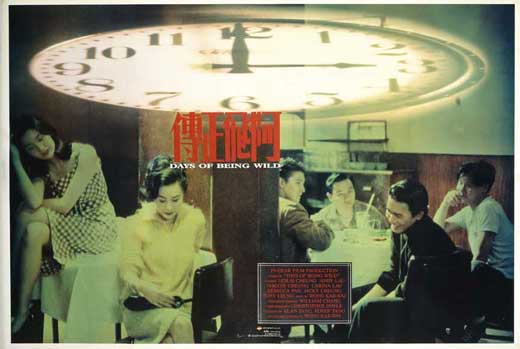
Another poster on my wall, whisked away from outside some film festival, is a lovely one of Wong Kar Wai’s Days of Being Wild. I used to be a fan, and could probably still summon something of my old enthusiasm for Chungking Express, Fallen Angels and Happy Together — despite the unmitigated disaster that was My Blueberry Nights. But I’ve never watched Days of Being Wild. It’s as if the poster has sated my curiosity. The bluish-green tint to it, juxtaposed sharply with the bright red Chinese characters bunched together in the centre; the strangely flattened clock that seems to suggest that time (for being wild?) is running out — the whole thing has a stylised melancholy so typical of Wong Kar Wai’s aesthetic in the ’90s, that it makes me feel like I’ve watched the film.
The mainstream Hindi film poster, no longer painted, has little to separate it from the mainstream Hollywood poster: they share the generic, claustrophobic effect produced when all the ‘designer’ is doing is fitting in the film’s big faces. There are, of course, occasional posters which do more with photographs, if they use them at all. I remember admiring the ones for Dev D, which used a psychedelic palette of bottle green, dark pink and blood red, and tweaked images of the actors into mind-altering forms. There was Mahie Gill reproduced several times to create a butterfly; Abhay Deol’s face morphed out of recognition, with aviators and giant lips; a green Deol viewed through a pink vodka bottle. There was another (my favourite) where Gill and Deol’s profiles were superimposed so that they seemed to share a single eye. It sounds monstrous, but in fact it succeeded in conjuring up a strange sense of stillness, of the merging of souls.
Dibakar Banerjee’s Love Sex Aur Dhokha was another film with strongly conceptual posters. They used the acronym LSD strategically, also producing psychedelic images, each with a scarlet heart placed at the centre. In one, the ‘heart’ was made up of two pairs of entwined feet, suggesting sex. In another, it was a pincushion, suggesting pain. (Caused by the dhokha, naturally.)
But what I think makes for the most marvellous posters, really, is text used either alone, or in conjunction with images. Dev D’s posters incorporated some phrases from the film’s songs: ‘Emotional Atyachar’ appeared bookended by the bandwallas who played it, ‘Ek Hulchul’ emerged in a spiral of smoke from Chanda’s (Kalki Koechlin’s) smouldering cigarette. But very little use is made of typography even in these designs. The only recent example of a recent poster with attention to type that I can remember offhand is English Vinglish, which did the obvious well, by placing a Devanagari ‘ga’ and ‘sha’ in place of ‘g’ and ‘sh’, effectively highlighting both the Indianness of the title and the film’s linguistic theme.
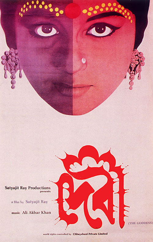
The master of the typographic poster was, of course, Satyajit Ray. Each was more striking than the last. The all-black Joi Baba Felunath poster had no images at all; just the film’s title in plump geometric white, the Bangla letter ‘la’ holding a pistol, from which a shower of sparks emerges to create the only triangle of colour on the page. Shatranj ke Khiladi, using English, created a typeface whose heavy, leaden bottoms evoked the form of the chess piece. The most unforgettable is probably Ray’s poster for Devi (The Goddess), where the eerie energy of Sharmila Tagore’s face, half in shadow and half in blazing light, is echoed by a typescript that seems aflame. The word ‘devi’, in Bangla, forms the crimson outline of a temple. Someday soon, perhaps, I’ll see a new poster as good as that in a cinema — something really worth stealing.

1 June 2011

Odd jobs in Delhi

Just read a story in the Sunday Guardian about handpainted signs, which reminded me of seeking out the juice stall sign painter Charan Singh, in Chandni Chowk sometime in the summer of 2007. So I dug up four short sketches I did as part of that long-ago Time Out Delhi cover story on unusual occupations. Enjoy.

Juice-stall sign painter

Charan Singh
Makes: Rs 60-200 per sign


(Photo credit: Abhinandita Mathur)

Charan Singh wasn’t always a painter of signs. He used to have a job in the railways, until he decided to devote himself full-time to the kind of work he really enjoys. That was sometime in the 1960s. Singh doesn’t seem to have any regrets, and his sons Subhash and Anil have also learnt the art. (Though Subhash points out that this is not all he does.) Charan Singh claims to have invented the distinctive style of the Delhi juice-stall sign. “I started it,” he said. “Others try to copy it, but they fail.”

Whether Singh really is the sole repository of the art is uncertain, but his house-cum-workshop in Sarai Topkhana (just off HC Sen Road in the Chandni Chowk area) is definitely a storehouse of colour. Prepared signs in plastic or rexine hang all along the courtyard walls. The smallest is one-and-a-half metres, and the longest three metres. Depending on the client’s demands, the sign can have just lettering, or a fancier design that incorporates flowers, fruits and even faces. “Shah Rukh and Salman are the favourites, especially Salman after Tere Naam. There hasn’t been a Golden Jubilee film after that, na?” said Singh. “Among the heroines, it’s Aishwarya.” Singh can churn out a small sign with lettering in 20 minutes flat, but a larger one with Salman and Ash – yes, the pairing is a bit out of date – can take up to three hours, and costs Rs 200. Has the rise of digital signage affected the business? Yes, said Singh, it has. But he’s upbeat about the future. “Computer mein itni show nahi hai, chamak-dhamak nahi hai. Aap dekhna, haath ka kaam hi chal niklega.”

***

Urdu-English legal translator
Murtaza Ali Khan
Makes: Rs 80 per page

There is an unending series of men at desks with typewriters outside Tees Hazari, Delhi’s largest district court. But not all of them have cupboards full of documents in a script indecipherable to everyone but themselves. Murtaza Ali Khan does. Sitting behind a sheet that serves as an improvised curtain against the scorching sun, Khan pores over legal documents written in shikasta – an Urdu script that is no longer taught and that even those conversant with Urdu find hard to understand. “Shikasta ko broken script kehte hain. Tuti-phuti language aur dilapidated documents, yahi padhta hoon main,” smiled Khan. He used to be a typist, but as more and more people coming to the court with shikasta documents started asking him to translate, he decided to specialise. Most of the documents he receives are property-related ones, which need to be translated for use in court proceedings, to get a bank loan, or sell property. He also gets nikahnamas and talaqnamas. And fatwas. “I get regular customers from banks and the Pakistan Embassy,” said Khan. “Many people even come to me to get old documents forged. They know I have the skill. But I always refuse.” But Khan wants to branch out of translation. Holder of several degrees, including a BA from Delhi College (now Zakir Hussain), an Adeeb Kamil in Urdu from Aligarh, a Bachelors in Education from Taleemghar, Lucknow, and most recently, another BA in Urdu from Maulana Azad National University, Hyderabad, he is all set to start on an LLB.

***

Protest photographer
Joginder Dogra.
Makes: Rs 30-50 per print sold


(Photo credit: Abhinandita Mathur)

For how long have you been a professional photographer?
Twenty years. My uncle was chief photographer in Punjab Kesari, so I came into this line through him. But it was very difficult to establish myself in my own right. I would take photographs, and if they were accepted, they would appear in his name. One day I decided, enough is enough. From that day I started taking my photographs to other places.

When did you make Jantar Mantar your beat?
Well, I had been in Delhi long enough as a photographer, I knew that there is always something happening here. So I started coming regularly. Now it’s part of my daily routine – I come here at 10am and I hang around until four or five in the evening, taking photographs of any protest demonstration that happens.

Who do you sell the photographs to?
Many different places. I have a regular arrangement with two Hindi city papers – Apni Dilli (a weekly) and Meri Dilli (a daily). Apart from them, I offer my photos to press agencies. And, of course, I sell copies to the protestors themselves. Unko chahiye hota hai na, record ke liye. Nowadays, groups who’re planning a demonstration, if they don’t have a photographer, they even contact me in advance, saying arrive at such-and-such a time.

What’s been your greatest Jantar Mantar photo moment?
It was on July 29, 2006. A man set himself on fire. He was from Etah – his kids had been kidnapped and he had been sitting here at Jantar Mantar for some months. Pata nahi usko kya hua, that day he just lost it. He poured oil on himself and lit a match. Nobody else was here, it was three in the afternoon. The photograph I took, I gave it to Associated Press, and they submitted it to the International Photo of the Year competition. It came fifth out of 44,000 submissions. I got a certificate. But I still haven’t received the money.

***

Voiceover artist and mimic
Sundeep Sharma
Makes: Rs 70,000 a month

Sundeep Sharma’s story sounds a bit like one a successful film star might tell about himself: Amitabh Bachchan in a minor key. He grew up in a small town (Bareilly), came to Delhi with “three thousand rupees and the number of Discovery Channel” in his pocket, and was told by his first UTV interviewer that he better “pack his bags and become a writer or something”. But Sharma was sure that his voice was his fortune. Having discovered a talent for oratory in Class XII, when his school principal challenged the boys to match a girl who had won a district-level debate, he prided himself on being the kind of debater who “never came second”.

So he stayed on in Delhi, doing voiceovers for serials on All-India Radio (“mostly ten gaonwalas hearing about some new government scheme”), and working on his skills. “I learnt about voice exercises, pauses, stresses, throwing your voice,” said Sharma. “I did an acting workshop with Barry John in 2003, when I learnt that there are four vocal registers. For instance, to speak in a deep voice, you need to speak from your stomach. For a high, kiddie-type voice, you close your eyes, fill your belly and think that the voice is hitting your skull.”

UTV approved him in his sixth attempt. And then mimicry happened – by accident. Seven months after Sharma auditioned to anchor an NDTV show called Gustakhi Maaf, they called to ask if he’d like to try mimicking Pramod Mahajan, whose voice matched his in texture. “It was when that voice became a hit that I started trying out other voices,” said Sharma. “Now I do Vajpayee, Advani, Mulayam, Shah Rukh, Saif, Nana Patekar, Om Puri, Navjot Sidhu, Sachin Tendulkar. Old film stars like Jagdeep, Jeevan, Dilip Kumar, Prithviraj Kapoor are easy – they had a particular style. Imitating Aamir Khan is difficult, because he changes his voice with each role.” But Sharma prefers doing “normal characters” (a Bihari panwalla or a Bengali babu) to mimicking famous people. And he’s branching out into stand-up comedy. In Sharma’s own words: “Pehle I would call Bareilly and say ki saat baj kar pachpan minute par meri awaz TV par aayegi. Seven years down the line, I feel like I can be on stage as well.”

Published in Time Out Delhi, 2007.