Showing posts with label advertising. Show all posts

28 June 2020

Virtually Masterful: Raja Ravi Varma on Google Arts and Culture

A piece for the latest issue of India Today, on a new Raja Ravi Varma exhibition -- online.
In Reena Mohan’s 1992 documentary about Kamlabai Gokhale, there’s a moment when the remarkably lively nonagenarian actor remembers Dadasaheb Phalke, the father of Indian cinema, whose 1913 mythological Mohini Bhasmasur made Gokhale one of the first Indian women to appear on screen. Her gaze settles contentedly on an image she has clearly held in her mind for nearly 80 years. “Black sherwani, pagri on his head, spectacles,” she says. “He was like someone in a Ravi Varma painting. It made you happy to see him.”

Raja Ravi Varma may well be the only Indian artist to have achieved such instant recall, and retained it for a century and a half. Born in 1848 into a family close to the Travancore royals, he was already a household name in Gokhale’s turn-of-the-century childhood. Starting as a portraitist to princes, Varma’s printing press made his work wildly popular in reproduction. His chromolithographs of Hindu deities and his scenes from the epics and myths became calendar art and advertisements. Millions were happy to see them.

On April 29 this year, Ravi Varma’s 172nd birth anniversary, Google Arts and Culture unveiled a massive digital retrospective of his work, with over 700 images and videos. Although many of these were already online, the Google exhibit offers higher resolution images and new kinds of access by grouping works from across museums into thematic ‘stories’, creating a display that caters to a wide range of visitors.

You can choose, for instance, to go on a photographic tour of the Kilimanoor Palace in Kerala, Varma’s home. You can attend to his realistic detailing of jewellery, or look at plants in his images. You can focus on a particular painting, like ‘The Bombay Songstress’—displayed here with a brief musical clip from the classical singer Anjanibai Malpekar, who may have been its subject. You can go beyond Varma to works stylistically inspired by him, in portraiture or in popular advertising, where his style was copied as standard form. You can watch a video about designer khadi saris that duplicate Varma paintings. You can run a search for all the green images, or all the yellow ones. The ‘Art Transfer’ feature turns your photos into artworks, while ‘Art Projector’ can bring a work into your living room. “We aim to develop technology that lowers some of the barriers to accessing culture, and is playful and engaging,” Simon Rein, program manager at Google Arts and Culture, told me on email. “People who know and love Ravi Varma’s work already will have plenty to find when reading the stories and zooming into his masterpieces. But for everyone else, browsing by colour, to take your example, might just be the starting point to discover the beauty of his art for the first time.”

Google names nine partner organisations for this online exhibition, of whom the most important appear to be the Ganesh Shivaswamy Foundation, with eight stories, and the Raja Ravi Varma Heritage Foundation, with 20. Each individual image is usefully annotated, but curatorial text across stories is marred by repetition, contradiction, non-standardised spelling and even typos. 

For instance, a panel in one story reads: “Repeated demand for copies of his paintings led Sir Madhava Rao, the diwan of Travancore, to suggest that Varma have some of his paintings reproduced as prints. Although paintings were earlier sent to Europe, mainly Germany, to be lithographed... Ravi Varma chose to set up his own printing press in Maharashtra in 1894 instead.” Another story narrates the same thing differently, and with alternate spellings: “It was the repeated demand for copies of his paintings which led to the suggestion by Dewan Sir Tanjavur Madhava Row that Ravi Varma send some of his paintings to Europe to have them oleographed.”

Elsewhere, the facts get confusing: “The Ravi Varma Fine Art Lithographic Press was set up in first in Ghatkopar and eventually in Lonavala”, we read in ‘The Gods Came Home’. But another story on the press states equally categorically that “The Ravi Varma Fine Art Lithographic Press was set up in Girgaum, Bombay, and commenced its operations.” These may seem like quibbles, but they represent a wider tendency, especially rife online. Google Arts and Culture wants its India-specific exhibitions to match those in the world’s great brick-and-mortar museums, more editorial oversight is needed.
 
SIDEBAR:
Three more Google Arts and Culture Themes Relating to India

Women in India: Unheard Stories is a marvellously thoughtful response to the skewed coverage of women in the media. Online exhibits range from "Inspirational Firsts' like Dr. Rakhmabai, the first practicing woman doctor in India to present-day women scientists, from depictions of the female body in Indian temple art to stories about women artists

Crafted in India, created in collaboration with the Dastkari Haat Samiti and others, is a rare virtual engagement with the stunning variety of artisanal skills that still survive in India. With videos that take you from a wood-carving town in UP to an Assamese organisation making paper from rhino and elephant dung, this is the best kind of travel, and not just in Covid-19 times.

The brilliant Indian Railways exhibit caters as much to history and engineering nerds as to wannabe virtual travellers, introducing you to station-masters and historic architecture as well allowing you to travel famous Indian railway routes in 360 degree glory.

Published in India Today, Sat 27 June 2020. 

The page as it appears in print below:


Gulabo Sitabo mines what remains of old Lucknow for visual a


Read more at:
https://mumbaimirror.indiatimes.com/opinion/columnists/trisha-gupta/minding-the-gap/articleshow/76668202.cms?utm_source=contentofinterest&utm_medium=text&utm_campaign=cppst
Gulabo Sitabo mines what remains of old Lucknow for visual a


Read more at:
https://mumbaimirror.indiatimes.com/opinion/columnists/trisha-gupta/minding-the-gap/articleshow/76668202.cms?utm_source=contentofinterest&utm_medium=text&utm_campaign=cppst

24 December 2017

Sex and Sympathy


Why sari-wali-bhabhi and late night show go perfectly together, and other thoughts on sexiness in India, after watching Tumhari Sulu.


Tumhari Sulu is a delightful film, though it contains several different ideas jostling for primacy, and sometimes it seems a pity that it refuses to plump openly for one of them. The first of the themes advertising man Suresh Triveni picks is the gap between the heard and the seen, the imagined and the assumed, the external and the internal. At one level, the narrative focus on voice is a way of undercutting modern consumer culture's unrelenting focus on the visual, on how appealing things look - as well as playing with our idea of what a sexy woman looks like.

The seductive disembodied voice of the radio jockey is the perfect device to make us rethink our painfully circumscribed ideas of what - or who - is sexy. We've already had one depressing cinematic subplot this year about a young man who can't reconcile his actual experience of sexiness with his preconceived notions of what sort of woman could turn him on: in Lipstick Under My Burkha's segment about Ratna Pathak Shah's intimate telephone conversationist, "Rosie". And back in 2011, Shujaat Saudagar directed awonderful two and a half minute short fiction film called A Day in the Life of India (Belle de Jour) which turned on a similar disjuncture between our unimaginative mainstream ideas of sexiness and the multi-hued, unpredictable reality of it. (The short is available on Youtube, and worth looking up, not only because Tumhari Sulu seems to owe it some acknowledgement).

Triveni's script might be seen as a response to a world in which people's potentially varied individual tastes are mainstreamed into predictable singularity by mass advertising. Tumhari Sulu pushes back -- though perhaps not with enough conviction -- against the increasingly ubiquitous vision of the attractive female body peddled by the Indian fashion and entertainment industries. By turning Vidya Balan's middle class housewife, with her ample sari-clad figure and unfashionably plaited hair, into a fantasy woman for the (mostly male) listeners who tune into her late-night radio show, Triveni plays with one of the more visible contradictions inherent in contemporary Indian sexual culture: the fact that while Bollywood and fashion valorise the skinny, fair, straight-haired, urban, Westernised young woman, a huge amount of desi erotica and porn is built upon the sexualisation of the generously endowed, sari-wearing bhabhi figure.


That is the powerful trigger that the radio channel boss, Neha Dhupia's Maria, is drawing on when she comes up with the idea of a programme for Sulu to host: "Sari wali bhabhi, late night show". It is an association that at least every Indian man in the film's audience will have no trouble making. There's no disjuncture there.


And yet the "sari-wali-bhabhi"'s attractiveness can apparently now only be a dirty secret. Everywhere that Vidya Balan's character goes looking for a job, the ostensibly English-speaking, Western-clothes-wearing, thinner and inevitably younger women who give her the once-over are visibly judging her for not being more like them. "Sari-wari nahi chalegi," declares the woman telling Sulu about a low-paying job at the gym. "Kabhi job kiya hai?" asks the reed-thin, shrill receptionist at Radio Wow, looking down her nose.

But while she's too 'behenji' for the gym types, Sulu is too free-spirited for her superior elder sisters. A desperately unlikeable pair, Sulu's sisters stand in for the stultified idea of respectability that holds the middle class in its vicelike grip. The terror of being seen as 'cheap' is deep, and it isn't just men but women who use it to police other women. And judgements fly thick and fast from this end, too - based on what you wear, how late you're out, whom you speak to.

Sulu is that wonderfully identifiable in-between figure, squeezed by both sides, and still effervescently herself. She embodies both the underestimated housewife character that we have started to see on the Hindi film screen from Gauri Shinde's English-Vinglish onwards, and the unapologetically lusty wife with a taste for the good things in life, played by Balan herself in 2013's Ghanchakkar and 2014's Shaadi ke Side Effects, or by Huma Qureishi in Jolly LLB 2.

Watching Balan light up the screen as Sulu, it's blazingly obvious that no-one but she could have conjured up this combination of playfulness and wholesomeness, producing gentle innuendo out of domestic metaphors - and vice versa. In the film's most sugary scene, Sulu gets a call from an elderly gentleman who says she reminds him of his wife. There's some channelling here of Balan's own earlier turn as an RJ, a decade ago, in Lage Raho Munnabhai, where her slightly insufferable goodness was on display in her attachment to an old age home. 

But even apart from this homage to Balan's filmic history, Triveni knows what he's doing. He plays on the use of radio in the cinema (a huge subject which this column has barely touched) by combining the visual and the aural: making sure we see the sympathy-generating figure of the old man heating up his dinner for one, and showing us that Sulu, though she can't see him, has the instinctive femininity to respond to him exactly as she should: with warmth and just a smidgeon of flirtation, but nothing too inappropriately risque. Here the sari-wali-bhabhi shows us that sexuality can't be divorced from one's womanhood as a whole, and that can't be separated from one's humanity. It is a fine model of sexiness with which to leave the cinema.

25 November 2015

The World as Picture: Book Review

A book review published in Biblio's Sep-Nov 2015 issue:


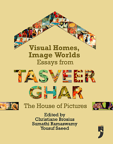
Visual Homes, Image Worlds: Essays from Tasveer Ghar -- The House of Pictures
Ed. Christiane Brosius, Sumathy Ramaswamy 
and Yousuf Saeed.

Yoda Press, 2015.

Allow me to start this review with a triptych of images — since Tasveer Ghar, as the name suggests, is all about pictures. An online database initiated in 2006 for collecting, digitising, and documenting the popular visual culture of South Asia, Tasveer Ghar has generated exciting conversations among scholars and arts practitioners, around the social, political and performative lives of images. The beautifully produced Visual Homes, Image Worlds is a collection of essays generated by the Tasveer Ghar network (and first published online).

The images I want to discuss appear in different essays in the book. But to me they seemed to speak to each other across the pages. The first picture is the frontispiece of Richard H Davis’s superb, succinct essay on “God posters for and of worship”. It features a smiling sari-clad woman in side profile. Holding an aarti thaali, her head covered respectfully, she raises her eyes to something we cannot see. Beyond the scalloped window arch in which she is framed, a series of South Indian-style temple gopurams and coconut palms are silhouetted against the evening sky. The caption reads: ‘A Hindu Devotee Prays.

'A Hindu Devotee Prays' -- Calendar Poster, printed by Oriental Calendar Manufacturing, mid-20th century 
Davis points out that the Calcutta Art Studio, one of the first companies to issue chromolithographs of Hindu deities, swiftly realised that the Indian public wanted images of the gods, but “single prints... for worship, not bound volumes for leisurely perusal”. The recognition led commercial publishers and companies to produce calendars, posters and other visual material that could cater to this demand. But slowly, as Davis shows, images produced for worship were joined by images of worship. The incipient form of these was the Lakshmi or Ganesh with a plate of prasad and/or lit diyas painted at their feet, thus incorporating the intended puja samagri (items used for worship) into the image itself. The image I’ve described could be said to be a more advanced version, where not just the puja samagri, but the worshipper is mirrored within the image. In this particular poster, there is no deity at all. But there is a temple, and a human devotee who contemplates the divine. 


The second picture I want to point out seems to me to echo the first in some ways, and differs from it in others. The first image was dated mid- 20th century, while this dates to the late 19th or early 20th century. It is a beautifully illustrated textile label, included in Catherine B Asher’s article “Fantasizing the Mughals and Popular Perceptions of the Taj Mahal”. Here, too, there is a human figure in the left foreground, framed within an arch and looking out into the distance. The object of contemplation here is the Taj and its reflection, not a deity or a temple. The young man stands with his back to us, wearing a kurta and dhoti, as well as a fetching red turban and a red sash around his waist. Asher describes him as “overwhelmed by the building’s significance, or perhaps smitten with love”. There is no obvious religiosity here, but the old mendicant in red robes, seated to the right of the image, may be said to provide a hint of the spiritual.

The third image dates to the present day: 2010, to be precise. It is a ‘beautification mural’ on Chennai’s Anna Salai, made by the artist JP Krishna, and reproduced as part of Roos Gerritsen’s essay on the gradual replacement of political and film hoardings along the city’s major arteries by murals meant to signify “Tamil culture and heritage”. On the right hand side are two Mamallapuram temples, their stone carved outlines reproduced in almost photographic detail. On the left, again with their backs to us, are two figures admiring the grandeur of the buildings. Like the woman in the first image and the young man in the second, these viewers stand in for us — the real-life viewers, standing outside the frame. And in this case, they’re tourists.

'Beautification' mural by artist JP Krishna, Chennai

These three images are drawn from three very different time periods, and for very different purposes — calendar art for Indian consumers, a commercial textile label to be sent abroad, and a street-side mural created by municipal fiat to project a new aspirational ‘global’ urbanity. And yet, in incorporating the viewer’s gaze into the image itself, I see these images as being very clearly in conversation. Looked at together they open up a whole range of thoughts about the aesthetics of looking: whether the contemplation of beauty is the same when the subject is perceived as divine, as spiritual, or as ‘world heritage’. At one level, it is a conversation that emerges from the old Benjaminian chestnut about the loss of aura, but in terms of these specific images, it could only have unfolded within the pages of this book.

And this is no accident. Through the essays here, popular visual culture in India emerges as an under-explored “bin of history”. Rummaging through it is both a way to produce an alternative archive, and challenge tightly-policed notions of genre. As the editors point out in their Introduction, the Tasveer Ghar archive is a place of cross-fertilisation. Indian images that were mass-produced, “be they greeting cards, god posters, patriotic prints, street art, advertisements or cinema hoardings”, journey through various sorts of worlds, and as they do so, “develop complex biographies and relations with other images”. Single images (or a constellation of them) often freely criss-cross any boundaries that might exist between public and private, ‘local’ and ‘global’, religious and secular (often more like sacred and profane), and finally, citizenship and consumer-hood.

Patricia Uberoi’s essay ‘Good Morning – Welcome – Svagatam’, suitably for the first Indian anthropologist to take mass-produced visual culture seriously as a subject of study, is placed at the start of the book, and helps locate calendar art within the dense matrix of tradition and modernity, ‘Indian’ and ‘Western’. “Stylistically and technologically, calendar art is a modern art form born of the Anglo-Indian colonial encounter, though it obviously has roots in several indigenous traditions also,” Uberoi writes. “Thus the recourse to ‘tradition’ in calendar art is both a reaction to, and is matched by, the appeal and prestige of westernized modes of representation.” She offers many illustrations of this, including a semiotic reading of goddesses and actresses saying “Welcome”, or “ILU ILU” and “Aum Sweet Aum” as hybrid appropriations of the coloniser’s language. 

Yousuf Saeed’s essay, which follows Uberoi’s, offers another example of hybrid appropriation in the form of Eid cards, which were likely to have been inspired by Christmas cards, and often actually used “blank picture cards imported in bulk from Europe [featuring] photographs of locations and objects as alien to Indian Eid as Greek and Italian sculptures and monuments, ... besides European cinema and theatre stars of the time!”. Saeed also traces the transformation of images on Eid cards. While early 20th-century cards – those created in India – contained ‘modern’ objects like aeroplanes, cars and multi-storied buildings, and no Muslim-cap-wearing boys, cards from the late 1980s “are dominated by images of Mecca, Medina, Quranic calligraphy, crescent- and-star icons, pious praying women and babies, and occasionally, romantic rose bouquets”.

The book is divided into sections thematically rather than by age or region or type of visual material. So, for instance, Christiane Brosius’s partly ethnographic meditation on Valentine’s Day cards is not placed alongside Yousuf Saeed’s, but in the section ‘On Love, Land and Landscapes’. Brosius’s subject is a fascinating one – how Archies’ Gallery helped create a ‘language of love’ for post-liberalisation India – but her insights sometimes seem rather obvious, and her analysis of the actual images sometimes lopsided. For instance, she insists that the scooter [on a card] cannot be an aspirational marker because it is tied to “lower-class mobilities, small-town aspirations, and a ‘Nehruvian’ petit bourgeoisie”, seeking to establish its present-day association with freedom using An Evening in Paris (1967) — really a rather old cinematic reference point! All of this ignores the basic fact that Archies’ clients are almost all school and college students, and for most of these, a two-wheeler certainly remains an aspirational thing.

JFK and Nehru with Kruschev watching,
magazine illustration by K. Madhavan, ca. 1960
Collection: S. 
Marieswaran
In the same section, Sumathi Ramaswamy looks at another profoundly familiar form of visual culture that has been crying out to be studied: the mapped form of the nation in popular prints. “In the artful mapping of the bazaar,” she successfully shows, “bodies appear to matter more than boundaries, the affective more than the abstract.” But Ramaswamy’s surprise at what she sees as these free, demotic appropriations of cartography, seems surprising: surely one genealogy for 20th-century Bharat Mata ‘maps’ lies within pre-colonial cosmological traditions of map-making, whether 18th-century Rajasthani images like that of Krishna as Visvarupa, containing the cosmos within the divine body, or Nathdwara Pichhwais of pilgrimage routes.

Kajri Jain’s essay on monuments, landscapes and romance in popular imagery is a wonderful example of how cross-fertilisation works in Indian visual culture. Drawing on religious/ mythological prints, calendar art and cinema-inspired paraphernalia, Jain argues that the framing and staging of romantic couples – whether legendary folk lovers like Sohni and Mahiwal, mythical ones like Visvamitra and Menaka, Hindi film couples or real-life ones – consistently represents them “in and for the public: outdoors and facing the viewer rather than or as well as each other”.

Between Rosie Thomas's analysis of the very particular Orient peddled by early Indian cinema (Arabian Nights, the Wadia version of Aladdin, Alif Laila, and so on), Sabina Gadihoke's tracing of film history through Lux ads, and Vishal Rawlley's painstaking delineation of the types of 'sexy ladies' on Bhojpuri music album covers, the 'At the Movies' section takes in a wide swathe of the film world.

In the ‘Consuming Images’ section, Philip Lutgendorf’s analysis of tea advertisements deals with familiar terrain in a fascinating, thorough fashion. I enjoyed Abigail McGowan’s tour of the ‘modern’ home, and her argument about the erasure of labour from these depictions of urban women. I was less persuaded by her pitting her visual archive against cherry-picked literary sources from a previous era: in particular, the comparison of mid-20th century calendar art with The Bride’s Mirror (an Urdu classic from 1869) seems strange.

The section ‘Of Gods and Cities’ bridges two rather different themes. Beginning with the Richard Davis piece discussed above, we move to Annapurna Garimella’s discussion of grihani (housewife) aesthetics, as expressed in Dasara doll-displays in South Indian households. The theme of images that are used to perform identity in public segues nicely into Shirley Abraham and Amit Madhesiya’s “Gods on Tile”’, which explores – somewhat repetitively – an urban phenomenon we’ve all seen: the use of religious icons to prevent people peeing in public space.
The deliberately engineered transformation of public space is also the subject of Roos Gerritsen’s “Chennai Beautiful”, mentioned earlier. Gerritsen’s analysis of ‘Tamil heritage’ as enshrined in Chennai’s new murals is detailed and interesting, but a less entrenched ideological perspective might be better able to unpack the contents of what is currently lumped together under the too-easy rubric of “neo-liberal globalisation”, “neo-liberal nostalgia”, and “neo-liberal middle class publics”. How do we understand, for instance, the fact that many of these 'sanitised' murals are by the same artist who made the now-removed political hoardings?

Stephen Inglis’s essay on the hugely popular artist K Madhavan – who made the original banners for SS Vasan’s legendary film Chandralekha (1948) – is a revelation, and again, demonstrates powerfully the way that cinematic imagery, product advertising, religious iconography and political propaganda flow in and out of each other. Madhavan’s vast and fascinating body of work (of which only a fraction is yet in any archive) makes clear, once and for all, that the study of visual cultures is truly fecund terrain, in which all of India’s obsessions can come together. May Tasveer Ghar's many interminglings continue to bear ever richer fruit.  

Published in the literary review journal Biblio, Sep-Nov 2015. 

6 September 2015

Painting the Stars

Today's Mirror column:

FilmIndia's memorable covers reveal the intertwined history of advertising and journalism, art and cinema.


Among the page-turning pleasures of Sidharth Bhatia's luxuriously-produced new volume, 
The Patels of FilmIndia, are the pictures. The Patels in question are editor Baburao Patel and his much younger wife Sushila Rani, who together ran FilmIndia, the country's most popular film magazine for much of the first half of the 20th century. At its best, the magazine seems to have been an irrepressible mix of witty one-liners, scathing reviews, bizarre rants -- and of course, industry gossip. But it could never have achieved its popularity were it not for the remarkable images - often in full colour - that appeared in its pages. 

The founding of the magazine in 1935 was the result of a collaboration between Baburao - who had worked as a film journalist for something called Cinema Samachar, and also made five films in the period 1929-1935 -- and a man called DN Parkar, who owned a printing press called New Jack. An offshoot of Prabhat Studios, New Jack had become a lucrative business based on Parkar's monopoly on printing anything the Pune-based film production house brought out: posters, handbills, books. "He knew Baburao and they decided to launch a film magazine; their rationale was that since they had a press, and paper was easily and cheaply available, venturing into publishing made sense," writes Bhatia. "BB Samant and Company, another child born out of Prabhat, had the rights to the publicity of the film company and could be relied upon to give ads." 

From the start, it was clear that production values were going to be high. The launch issue, dated April 1935, was priced at 4 annas. Printed on high quality art paper, it had a rather spectacular hand-painted cover image with a woman's face in a rectangular frame, and the rest of the space devoted to a painted backdrop showing a kind of grand Indian crowd scene: bullocks, camels, turbaned men with spears, caparisoned elephants and a palm tree. The woman was Nalini Tarkhud, the heroine of V. Shantaram's film Chandrasena - which was advertised on the inside pages. 

Soon, FilmIndia's beautifully hand-painted covers began to themselves double up as advertisements for particular films - sometimes much before they arrived in theatres. In one fascinating instance, the January 1946 cover announced Mughal-e-Azam with a rather lovely painting of Prince Saleem picking roses in a garden. May 1946 and July 1946, too, were devoted to illustrations of K. Asif's Mughal-e-Azam. Yes, you read that right - 1946! It seems that Asif first planned to make the film in that year, with an actor called Chandramohan and the then-upcoming Nargis. Except Chandramohan died before shooting could begin, and the film was finally completed (with its now-legendary cast of Dilip Kumar, Madhubala and Prithiviraj Kapoor) only fourteen years later, in 1960. Those FilmIndia covers from 1946 are probably among the last surviving reminders of the film that might have been. 

In October 1944, the FilmIndia cover was a eye-ball-grabbing colour illustration of a giant hand, reaching out to disrobe a distressed young woman in a golden crown and the gleaming bratop that would later become the staple costume of mythological Hindu females in Amar Chitra Katha. The image was publicity for the film Draupadi, produced by New Huns Pictures (Huns as in swan, not Attila) as a launch vehicle for Sushila Rani, whom the already-married Baburao had assiduously wooed and finally married. 

Sometimes the cover could even be given over to an actual product. The February 1946 issue, with a properly 'Oriental' couple (seated next to a brass surahi of wine and a rather incongruously modern Western-style loaf of sandwich bread) announced Panama Cigarettes as that which "Would have completed Omar Khayyam's Paradise". But although the magazine was unabashed about the tie-up between film publicity, product advertising and film journalism, Baburao was publicly adamant from the start that his reviews of films would never be coloured or prejudiced by advertisers. Writes Bhatia: "Advertisers who did not like this policy were welcome to take their ads elsewhere, he declared." 


The other noteworthy thing about these covers, of course, was that they were painted. Sabina Gadihoke, among others, has pointed out that the artists often took photographs as their reference points to produce realistic likenesses of the stars. But the standards of printing at the time did not allow for photographs to come out well enough. Gadihoke quotes Alyque Padamsee, who joined the advertising agency Lintas in the 1950s, as saying that copywriters had to be careful not to put lines like '"This is what Lux does for my complexion," says Mala Sinha', "because poor Mala's face would look like a poached egg." Often photographs had to be enhanced - dull studio backdrops enlivened, cheeks made rosier, lips reddened - for the requisite glamour to appear in printed colour. 

The artists credited most often on FilmIndia covers are DD Neroy and SM Pandit. The talented Sambanand Monappa Pandit (b. 1915) was among a new generation of artists who had graduated from the JJ School of Art in Bombay, and was much sought after. Like many of his ilk, SM Pandit simultaneously produced film-related work, product advertising and calendar art. Pandit's work is a stellar example of the cross-fertilization of style between Bombay cinema and the popular print representation of characters from Hindu mythology: the stars became more like gods, and the gods became more romantic, more sexualised. But that is another story.


Published in Mumbai Mirror, 6th Sep 2015.

2 July 2012

Half-century Advertising Deptt: Utterly, Butterly Delicious

From my Sunday Guardian column:

In the year 1966, the advertising campaign for a butter brand was assigned to an agency in Bombay. The brand, which had already been in the market for 10 years, was "processed from the purest milk under the most hygienic conditions by a dairy co-operative in Gujarat". Sylvester DaCunha, who headed the advertising agency, was quite clear that that positioning — and the existing tag line, 'Purely the Best'— was not going to cut it. He mentioned the campaign to his wife Nisha. "Why don't you say 'Utterly Amul'?" she said. To which (Sylvester tells us), he added, "Hey, what about, 'Utterly butterly Amul'?"

This is the sort of behind-the-scenes event fiction writers dream of. The hugely popular Mad Men — an ongoing American TV series about New York advertising executives, also set in the 1960s — contains at least one narrative where the winning campaign is something the 'wife' comes up with. Megan Draper's success with Heinz baked beans — "Some things never change" — is her tumultuous first and last foray into advertising. Nisha DaCunha's spontaneous suggestion to her husband led to a campaign that has lasted over 50 years.

Based on Sylvester's 'instinctive' feeling that Amul's emblem "should be a child, someone impish and loveable", his art director Eustace Fernandes created the "charming little poppet in a polka-dotted frock" that we know as the Amul girl.

One of the first Amul ads

The cheeky humour of the Amul girl, punning her way through years of Indian public life and popular culture, can now be enjoyed in a book: Amul's India, released last fortnight by HarperCollins. By Delhi book launch standards, it was an unusually formal affair. The people gathered in the large new Multi Purpose Hall at the India International Centre to listen to Rahul DaCunha (Sylvester's son, who has handled the agency for 20 years) did not know each other at all. Journalists and publishing faces were few. The audience, seated in rows on white-cloth-covered metal chairs was quiet, orderly and familial, as on a TV talk show.

The feeling was confirmed when Barkha Dutt arrived to host a panel discussion, followed by DaCunha, columnist Swapan Dasgupta and commentator Santosh Desai, best known for his regular Times of India column, City City Bang Bang. "Santosh is a Bombay boy who's moved to Delhi," DaCunha ribbed Desai. "Which city is his column about, I'd like to know!"

The Bombay-centric origin of the campaign is crucial. DaCunha talked about how what began with a single hoarding on Bhulabhai Desai Road has grown into an all-India campaign, with 132 billboards on 90 sites in 69 cities. The writers chosen for the volume, whether cricketing and film icons or social commentators, are almost all Bombay-based: from Amitabh Bachchan and Sunil Gavaskar to Shobhaa De and Rajdeep Sardesai.

Sardesai sees Amul hoardings as shaping elements of the genteel cocoon that was 1970s South Bombay. This South Bombay constituency is clearly core for Amul, its anti-politician consensus sharply revealed in ads like the one after 26/11, where a politician is shown surrounded by security guards, with the line, 'Will the real terrorist please stand up?'. True to that imaginary, Amul marked the 1995 renaming of Bombay into Mumbai with a teary Amul girl looking out wistfully at the city's skyline: the text read "Bom Bye!"

And yet, Amul also consciously seeks to transcend that English-speaking elite cosmopolitan image for a wider one. So they also produced a "My Mumbai, Love it or Leave it" ad, showing the Amul girl in five different regional costumes.

That the campaign has always been in English itself is a fascinating fact. To Dutt's question about whether Indians can laugh at ourselves, DaCunha responded that a 90s ad, which targeted Laloo Yadav's with the line 'Fodder of the Nation: Scamul', went by without any incident, but he could not run the recent 'Kol-kartoon' ad in Kolkata for fear of reprisal by Mamata Banerjee. But as Dasgupta pointed out, that was because no-one in Laloo's constituency was English-speaking. The increase in prickly reactions, he added, is crucially inflected by the fact that more and more people are now able to partially understand — and thus misconstrue — Amul ads.

Another fertile idea in the book is Alpana Parida's suggestion that the Amul girl draws on the mythical butter-loving Krishna: "The natkhat Krishna has become the iconic persona that all mothers seek in their child when they say with great pride that their son is 'very naughty'. In that context, the Amul girl is Bal Krishna!" Parida is definitely on to something here. But she doesn't dwell enough on the campaign's fascinating transformation of the 'naughty boy' — the son whose bad behaviour pretty much all Indian parents are likely to indulge — into the 'naughty girl'.

In real life India, a daughter's transgressions are much less likely to be condoned. Perhaps the fictional, not-real quality of the Amul girl, who allows us to laugh at ourselves, has also enabled a quietly radical transformation in how much middle-class Indians indulge their daughters.

20 November 2011

Book Review: The Best of Quest

This selection of articles from Quest, a socio-political and literary Indian magazine from the 1950s and 60s, offers perspectives that are still relevant today

The Best Of Quest
Edited by Laeeq Futehally, Achal Prabhala, Arshia Sattar
Tranquebar Press
pp 694, Rs. 695


"To organize a new union between our political ideas and our imagination – in all our cultural purview there is no work more necessary," wrote the American critic Lionel Trilling in 1946, in an essay called 'The Function of the Little Magazine'. Trilling's words were originally written in praise of the Partisan Review, a political and literary journal which began life as an organ of the American Communist Party but broke away after Stalin's rise to power, going on to complete a long and influential innings (1934-2003), with contributors ranging from Hannah Arendt and George Orwell to Susan Sontag and Philip Roth. But they seem oddly and equally suited to a journal that emerged from the other side of the political spectrum, at the other end of the world.

Titled Quest ("a quarterly of inquiry, criticism and ideas"), it was a journal started in Bombay in 1954. Laeeq Futehally, its Literary Editor, describes it as the outcome of a post-World War II resolution by a bunch of intellectuals that "never again should the minds of men be enslaved by evil ideologies and rigid "isms"." The Congress for Cultural Freedom, founded in Berlin in 1950, was devoted, in Futehally's words, to "the task of creating a worldwide ambience of respect for free thought and speech". Chapters soon emerged in other countries, many with magazines. Poet Stephen Spender agreed to edit Encounter in the UK. The Indian Committee for Cultural Freedom (ICCF) emerged in 1950, and in 1954, Minoo Masani (one of India's first advocates of liberalism) founded Quest, with poet and critic Nissim Ezekiel as editor.

The Best of Quest is a selection of essays, poetry and fiction from Quest's remarkable life of 20-odd years: a life brought to a close by a refusal to bow to Mrs. Gandhi's Emergency diktat that it be submitted for review before publication. Edited by Futehally, Arshia Sattar and Achal Prabhala, the volume gives us a sampling of what was clearly a superbly eclectic body of writing, united only by Ezekiel's injunction that it must be "by Indians for Indians" – a difficult condition, as Futehally points out, in "those days [when] we still glamourised anything foreign, including writers".

The poetry section offers delights both expected ("To force the pace and never to be still/ Is not the way of those observing birds/ Or women. The best poets wait for words," writes Ezekiel) and unexpected (a 1975 poem called 'Dasara' by the well-known academic Tejaswini Niranjana, who only finished her BA in 1979). The fiction section features Keki Daruwalla and Kiran Nagarkar, as well as translations of Kamleshwar and Premendra Mitra (the latter a Bengali classic called 'Telenapota Abishkar' which – the editors should really be telling us this – was made into a haunting Hindi film called Khandhar by Mrinal Sen). My personal favourite here is Arun Joshi's story 'The Gherao': deceptively straightforward and terribly moving.

But the form that really characterises Quest is the long, opinionated essay, with writers of all stripes taking on socio-cultural, political or literary subjects with idiosyncratic ease. Some of these would never get commissioned today – they are not 'topical'. But Claude Alvarez's scathing account of the "fabrication of a new religion" by Aurobindo and his companion Mira (the Mother) and the murky politics of the Ashram's takeover of Pondicherry's White Town, or Roderick Neill's sustained, almost scholarly comparison between sadhus and hippies ("In as much as they all represent channels for social deviants and adventurous individualists...the sadhu sects of India are bodies of 'drop outs'"), for example, deal with things that are very much a presence in contemporary India, and offer a perspective that can still surprise us.

On the other hand, an exchange like the one between Jyotirmoy Datta ('On Caged Chaffinches and Polyglot Parrots') and P. Lal ('Indian Writing in English: A Reply to Jyotirmoy Datta') makes one simultaneously laugh and sigh at how the same debate can carry on for half a century: is it "natural" for Indian writers to write in English, or are their reasons for doing so merely "expedient, even artistically dishonest"? Khushwant Singh provides a different sort of glimmer of recognition, despite the fact that the Delhi he describes has been almost entirely transformed in the 44 years since he wrote: "If you move in the right circles in the Capital, you need not cook any food in your house. It can be one continuous round of lunch, cocktail and dinner parties."

These occasional chuckleworthy moments apart, however, Quest comes across as largely focused on important and high-minded subjects: 'Persistence of the Caste System', 'Reflections on the Chinese invasion', 'The Concept of Justice and Personal Law in India'. "Quest was so far above popular culture and so disdainful in its indifference to the strange and bizarre events of everyday India that it needed at least one regular column that did some lampooning," the poet Dilip Chitre writes in a postscript, explaining why he felt the need to complement his 'serious pieces' on Indira Gandhi or Nirad C. Chaudhuri (written under his own name) with the irreverent pieces he wrote under the pseudonym 'D.'. D.'s columns ranged from a self-described "barbaric comparison" of Raj Kapoor's "chocolate-box love story" Bobby with Satyajit Ray's "saccharinous famine" in Ashani Sanket – where Ashani Sanket is found wanting because it does not even entertain the masses – to the argument that the sexiness of Hindi film heroines depended on their plumpness, "which goes to strengthen one's suspicion that more than one kind of starvation accounts for the female star's appeal in the Hindi cinema".

Some advertisements from the pages of Quest magazine

The editors must be thanked for bringing us a volume of scintillating – if sometimes verbose – writing from an era that seems enormously distant in some ways and not quite over in others. They have provided for those who want the dope on Quest being indirectly funded by the CIA (apparently it was, but the editors didn't know that) and offered much joy by reproducing advertisements from the pages of the original Quest. (Sample: 'When Sol has done his worst/ And really got you down/ Turn on a RALLIFAN and be/ The coolest man in town") But I have one complaint, which is that they have provided no introductions to the essays. There is not even a list of contributors, so that one will forever have to keep guessing about the identity of the wonderful Hamdi Bey who tells us that George Orwell thought of himself as "civilised" as opposed to Kipling who was "coarse", and wondering whether the author of 'The Gherao' is the same Arun Joshi who wrote the marvellous The Strange Case of Billy Biswas. Such a brilliant act of excavation, and an uncurated display?

Published in the Sunday Guardian, 20 Nov 2011.

16 February 2010

The Quiet Riot: Dibakar Banerjee profile

The middle class loves Dibakar Banerjee’s films. If only they knew that this is unrequited passion.


The first thing Richa Puranesh, Dibakar Banerjee’s wife of eleven years, remembers about him is his introductory line: “Hi, I’m Dibakar. I’m going to make films.” They were both in advertising then, and Richa remembers saying, “Right. Television commercials…?” To which Dibakar responded, with an air both casually explanatory and utterly certain, “No, films. The kind that Satyajit Ray makes.” Sitting in his 18th floor Parel apartment some fifteen years later, Dibakar Banerjee, highly-feted director of two of the most layered, thoughtful Hindi films of the last decade, Khosla ka Ghosla (2006) and Oye Lucky! Lucky Oye! (2008), laughs an embarrassed laugh.

It is tempting, especially when you know what happens in the end, to create an epic back- story. But Dibakar Banerjee is not the man to take the easy way out in any narrative, least of all an autobiographical one. He denies emphatically the self-confidence of that anecdote. “It sounds very glamorous, very determined. But nothing could be further from the truth,” he says. In a recent blog post, he has bluntly refused the romance of the struggle: “No one had it easier than me… I didn’t sleep on the platforms in Bombay, didn’t cart around my dog-eared script to various stars fresh out of make up in Juhu. I didn’t even call a producer. All I had were some silly ideas and a lot of arrogance...”

Dibakar’s story does start out quietly: a bright Bengali boy growing up in Delhi’s New Rohtak Road. It was an insular upbringing, in the way that a Bengali middle class upbringing can be, especially when your classmates are the North Indian children of West Delhi businessmen. The rest of the world is money-minded (“don’t play with them”), you’re told, while being drilled in what writer Amitav Ghosh once called “the jungle-craft of gentility”: the barely-hidden hysteria about academic success. Because “it would take just a couple of failed examinations” to end up over there, on the street. Dibakar was the model child: he topped his class, he won interschool quizzes, he learnt the tabla. But things didn’t stay smooth long. “In Class XI, his principal called me and said, Mr. Banerjee, Dibakar has failed in all subjects!” The stunned father swiftly put his son through a rigorous tuition routine, and Dibakar managed a 74% in Class XII. He also signed up for Agarwal Tuitions for the joint engineering entrance examinations and trotted off, several mornings after his Boards, to take the tests.

But secretly, he had applied to study Visual Communication at the National Institute of Design (NID), and once he made it, managed to persuade his befuddled parents to let him go. It was a few days after Dibakar had left for Ahmedabad that the engineering entrance results arrived. A friend happened to call his mother, who expressed her puzzlement that her son had gone off to this strange design thing when he’d got an A in every entrance test. “Aunty, A ka matlab hai absent,” the friend said, laughing. Dibakar hadn’t attended a single exam.

“He said nothing, but always did exactly what he wanted,” says his mother. She laughs now about finding an NID entrance form that asked: “Do you obey your parents?” and Dibakar’s response, in big bold letters: “NO”. But neither she, nor his father, were amused when, two and half years after having insisted on going there, Dibakar dropped out of NID. “My parents were pretty shocked. In achiever Bengali families, you do academically well. You don’t get chucked out and come back home,” says Dibakar wryly. His father somewhat shamefacedly admits to taunting his son as he sat around at their Ashok Vihar home, silent and bespectacled, seeming to do absolutely nothing: Since he was so clever, since he’d decided that he had nothing left to learn, what was he going to become: a Rabindranath or a Satyajit?

It took seven months before Dibakar found a job, as a trainee with a corporate film and AV maker called Sam Mathew. “Within one year, he was drawing 20,000 rupees,” says his father. Dibakar became first a copywriter, then a Creative Group Head for Contract Delhi, a subsidiary of ad major JW Thompson. It was at this time, around 1992, that he met Jaideep Sahni. Jaideep was brought in as the head of a competitor group, but Dibakar and he hit it off from day one, brainstorming on campaigns “across the partition”, physical and metaphorical. “We soon formed a firm alliance against the rest of the world,” laughs Dibakar. In 1997, both left the company, within months of each other. Dibakar started an ad film company called Watermark with two ex-NID friends, while Jaideep moved to Mumbai to work with Ram Gopal Varma on the script of Pyar Tune Kya Kiya, Jungle and later Company. “I used to miss him a lot. I’d call and say ki tu hamare saath aake kaam kyon nahi karta yaar?,” says Dibakar.

What happened eventually was the opposite. In 2002, Jaideep, ostensibly fresh from the success of Company but in fact increasingly unsure about whether the industry would ever allow him to write the kind of films he wanted to, called Dibakar. Savita Raj of Tandav Films, “essentially a Delhi-based ad agency”, wanted to produce a film about generation gap. Would he direct? Dibakar jumped at it, but it took four years of hard work and harder waiting (the grilling, tightly-budgeted, 45-day shoot was the easy part) before Khosla ka Ghosla saw the light of day. UTV finally decided they’d take it – on a second viewing that Boman Irani might have had something to do with – and from there on, things were smooth sailing. UTV even decided to co-produce Dibakar’s next project, Oye Lucky! Lucky Oye!

People who’ve watched both Dibakar’s films are often at a loss to reconcile them. Khosla’s deep identification with a middle class, with being “decent people”, seems irrevocably at odds with Oye Lucky’s merciless indictment of the hypocrisy of that very class. Dibakar himself is clear-eyed about what each film is doing. “The only thing patently false about Khosla is its climax – but that’s what also made it the darling of the middle class,” he says carefully. He describes an alternative ending, where the Khoslas, having failed to get back their plot from the swindling Khurana, join their son Cherry in the US visa queue. Jaideep remembers being “extremely attracted” to that ending, but ultimately persuaded Dibakar that no one was going to come and watch a film which didn’t give them something to hold on to.

The ‘born-again Hrishikesh Mukherjee’ tag is something Dibakar threw off with Oye Lucky, where a thief is betrayed by a respectable, smooth-talking doctor. He takes savage delight in having subverted the attempt to slot him as a clean, family entertainment sort of guy. “You’re a good filmmaker, you stay in the multiplex where good audiences with good taste come. The rabble can watch the Bollywood extravaganzas,” he says in a cutting imitation of our arbiters of taste. It’s clear that Oye Lucky’s darkly comic vein runs much deeper than the gentle laughter of Khosla. “He used to write Bengali verse, chhora. It was funny, but always satirical,” says his sister Mallika, eight years older. She recalls a poem he wrote as a ten-year-old about a zamindar whom no food can satisfy. The poem ended with the chilling phrase, “Shob theke bhalo khete goriber rokto” (What’s most delicious is the blood of the poor). [Dibakar later corrects this fond sisterly account, saying the line wasn't one he wrote himself but one he took from a renowned Bengali poet.]

It comes as no surprise to see that acerbic gaze directed at his own audience. “I know that many who like Oye Lucky actually laugh at the characters, not with them,” says Dibakar sharply. He himself may have an OSIAN’s audience in splits with his rendering of a Delhi Jat accent versus a Meerut accent, but as Richa Chadda (Dolly in Oye Lucky) puts it, “his characters never come from a space of mimicry.” Everyone has a context, a reason for being. The foul-mouthed Dolly who dances for a living but keeps a Tuesday vrat is as searingly observed as her sister Sonal, who won’t touch stolen money (or Dolly when she’s drunk), but quietly accepts her burglar boyfriend’s gifts.

Dibakar’s vivid eye and ear for worlds beyond his own owe much to the Bengali childhood mentioned earlier. It may have been insular in some ways, but it was also richly eclectic, immersed in a post-Nehruvian cultural universe. His mother, a municipal school music teacher and Hindustani vocalist, turned on Vividh Bharati’s Lok Sangeet every afternoon (planting the seed of Oye Lucky’s stunning folk music track, for which Dibakar wrote magnificent lyrics in Punjabi). Daily family music sessions embraced everything from Rabindrasangeet and classical to folk and film songs. The same omnivorousness extended to films (everything on Doordarshan, from Aan Milo Sajna to Jean Cocteau) and books: devouring the Hindi Champak and Nandan alongside the Bengali Shuktara and the racy pulp his grandmother borrowed from Bangiya Sansad Library. At fourteen, he made a storyboard of Bibhutibhushan’s adventure classic Chander Pahar (Mountain of the Moon) – in English translation. Dibakar remembers the linguistic shift to English as propelled by a quest for “higher knowledge”: looking up Brahms and calculus in the school library’s Encyclopaedia Brittanica. NID opened up a world “five times as big”, introducing him to rock and blues, history and anthropology, American Cinematographer, Bladerunner and Istvan Szabo. By the time Jaideep Sahni met him, “Dibakar had seen every film ever made.”

For someone so rooted in place and time, Dibakar is surprisingly unwistful about his move to Mumbai. “Delhi is about communities, stereotypes, mentalities. Bombay is about work, money, living spaces: pure lebensraum. It has an urban politic I’m excited by. And in any case, Delhi is a depressing place for a filmmaker to be.” As always, Dibakar’s grasp of the essentials is acute, unsentimental. He is matter-of-fact even about being nostalgic. “My kind of filmmaking depends on local detail to intensify the drama. Though if you psycho-analyse me, you might find I make films to capture what is gone,” he muses. He wants to make the films he does, but he doesn’t want to lose money on them. So he plans his budgets and runs an office that makes ad films on the side. And just when you think you’ve pinned him to down to a genre or locale, he ups and moves on to something else.

The edgy, digitally shot, Love Sex aur Dhokha, to be released this March, promises a raw, unapologetic take on love in the time of the media. LSD’s three interwoven tales, involving a suicidal sting journalist, a security camera company executive and a film institute student, reveal a world where desire is no longer pure or intimate, tinged as it is with exhibitionism on the one hand and voyeurism on the other. And yet these are love stories. Like the man – and unlike so many of his cool contemporaries – his films manage to be both riotous and thoughtful. As always with Dibakar Banerjee, cynicism is layered generously with humour, the humour layered with love, and so on until the circuit closes. One wouldn’t have it any other way.

From Tehelka Magazine, Vol 7, Issue 07, Dated February 20, 2010

10 May 2009

Art Review - The Mocking Birdy

In his first art show, adman Freddy Birdy prefers the mild mortifications of everyday wit.

THE FIRST THING you see when you enter Freddy Birdy’s first show of paintings is an enormous white canvas with a glossy-haired brunette suspended sexily upside-down, as if she’s being poured out of the giant Heinz ketchup bottle in the top right corner. Her scarlet lingerie echoes the McDonald’s red of the cartons in the other corner, from which bunches of fries sprout like slightly surreal flowers. The label reads, “Your proximity to a McDonald’s is far greater than your proximity to love.” In another painting, Superman rises in his famous underwear-worn-over-tights, against a background of Rupa briefs in Indian comic book colours.

At one level, these images are exactly what you might expect from a man who’s worked with several well-known advertising agencies (Grey Worldwide, Mudra and McCann Erickson) and orchestrated award-winning campaigns for brands like Thums Up, Vimal, Polo mints, Samsung and Taj Hotels: the interest in surface, the use of iconic images, the playful insertion of text, the shiny brightness of it all. But Birdy is reluctant to be seen as drawing on an advertising aesthetic: “Advertising images are more falsely-real, if you know what I mean: shiny hair, juicy burgers, happy families. Art is as disturbing as you want it to be.”

Neither is he happy with the boundaries around art — probably why he chafes at questions about his ‘text-paintings’: the tongue-in-cheek A Perfect Life, a dartboard with “Blowjobs” crowding the periphery and “Art” at the centre, or The Vocabulary of Fidelity, a gentle story-canvas. “I find that text has not only its own visual grammar, as a mass of words, but when read, it’s even more beautiful. You can form your own paintings. I don’t think that art has to ‘look’ like art: it should intrigue you, beguile you, thrill you, disturb you, entertain you. Art is anywhere you seek ,” he insists. “The way a housewife rolls out perfect rotis, isn’t that an art?”

This desire to establish the personal and the domestic domains as legitimate spaces for art is echoed in Contact Arora Properties, an enlarged version of a floor plan for an apartment (presumably Birdy’s own), with appropriate personal resolutions scribbled in. In one room, the artist’s scrawl declares, “I will drink more water.” And follows it up immediately with, “And vodka tonics.” A square marked “Bathroom” reads, “I will shower with a friend/I will save water”. It’s not always clear whether these sentiments are linked, but the juxtaposition opens up a space for laughter, which is integral to Birdy’s notion of what good art can do. “I think that Indian art has been serious for far too long. Why should great art be intense and brooding?” Birdy is determined to take everything — including himself — down a peg or two, but always with humour. If There was a time when nobody ate sushi provides pithy one-liners by which to navigate our era, Chain Painting is an extremely funny take on the fears and pretensions of the Indian art world. While he aspires, like his favourite Andy Warhol, to be the carefree but revealing chronicler of an era, for many people his work will stop short of such an achievement, evoking instead the aphoristic wit associated with the best advertising. Except here, as Birdy points out with characteristic candour, “It’s not promoting anything, except possibly the artist himself.”

From Tehelka Magazine, Vol 6, Issue 19, Dated May 16, 2009