As graphic storytelling gains momentum in the world
of Indian English literature, a slew of indie publishers become the champions of a new visual culture.
First published in Elle India, July 2013.
The Obliterary Journal is a compendium
of comics, typography and all sorts of visual pleasures, brought out by Blaft in 2012. It opens with a graphic foreword in which a bunch of symbols declare a war on text. “Obliterate literature!” says one angry pictogram. “Down with novels! Long live comics with publications of remarkable variety. And picture books and graffiti and wacky art!” “Alphabets are stupid!” pronounces another annoyed glyph. “Unless you handpaint them with a lot of style...”
There couldn’t be a better illustration of the exciting new climate for visual storytelling in Indian English publishing than this mock-serious manifesto. Of course, even such a whimsical call-to-arms recognises that books with “lengthy passages of unadorned text” aren’t going away anytime soon. But more and more publishers are beginning to see that there are other ways to tell stories than just through text. There is a realisation that the visual book can often do things that the purely verbal might find difficult. They can bridge the imagined gulf between children and grown-ups, serious and non-serious, and subvert the common perception of the picture book as necessarily lightweight. Conversely, they can leaven even the most serious subjects with a joie de vivre that can only come from images.
Mainstream publishers like Penguin and Harpercollins have used this medium to bring physicality and dynamism to subjects as varied as our gated cities, the Mahabharata and the emergency through writer-illustrators like Sarnath Banerjee, Amruta Patil and Vishwajyoti Ghosh. But it is the smaller, independent publishing houses that are really altering the Indian literary landscape. And they are the ones pushing the image to centrestage with publications of remarkable variety.
Blaft
For this publisher, the visual is often an end
in itself. From tear-out ‘postcard books’
that reproduce Hindi pulp fiction covers
(Heroes, Goondas, Vamps and Good Girls [2009])
or juxtapose contemporary newspaper
classifieds with retro images from Hindi
cinema and Raja Ravi Varma (Times New Roman
and Countrymen [2009]), to the tongue-in-
cheek, hard-to-explain subversive madness
of Kumari Loves a Monster (2010), Blaft revels
in the goofy, kitschy, off-the-wall worlds
of Indian art. As Blaft founder Rakesh Khanna
says, this is art that cannot be packaged either
as “tourist coffee-table book [or in] a white
cube gallery with wine and cheese”. Their
devotion to typography and pulp cover art
can sometimes junk narrative preoccupations
in favour of a celebratory visual anthropology.
First published in Elle India, July 2013.
 |
| A page from Blaft's Times New Roman and Countrymen |
There couldn’t be a better illustration of the exciting new climate for visual storytelling in Indian English publishing than this mock-serious manifesto. Of course, even such a whimsical call-to-arms recognises that books with “lengthy passages of unadorned text” aren’t going away anytime soon. But more and more publishers are beginning to see that there are other ways to tell stories than just through text. There is a realisation that the visual book can often do things that the purely verbal might find difficult. They can bridge the imagined gulf between children and grown-ups, serious and non-serious, and subvert the common perception of the picture book as necessarily lightweight. Conversely, they can leaven even the most serious subjects with a joie de vivre that can only come from images.
Mainstream publishers like Penguin and Harpercollins have used this medium to bring physicality and dynamism to subjects as varied as our gated cities, the Mahabharata and the emergency through writer-illustrators like Sarnath Banerjee, Amruta Patil and Vishwajyoti Ghosh. But it is the smaller, independent publishing houses that are really altering the Indian literary landscape. And they are the ones pushing the image to centrestage with publications of remarkable variety.
Manta Ray (MaRa)

The publishing collective’s self-proclaimed goal is to move away from escapist fantasy and superheroes to tell real stories about young people in India – their target readership. Their first book Hush (2010) told a tale of child sexual abuse in beautifully hand-drawn black-and- white sketched panels. Stark as its subject was, Hush was also striking for sticking absolutely to the suggestion of its title: it used no words. “I didn’t think I had the right to express what the girl is going through. I didn’t want to put words in her mouth,” says Prateek Thomas, one of MaRa’s founders, who wrote the detailed script on which the book is based. “Also, as a writer, I avoid declamation, exposition. I try to keep brevity. I like the art to do the talking.” Their more recent publications – an anthology of four stories called Mixtape and Twelve, a series of 12 character-driven narratives united only by the theme of choice – don’t steer as completely clear of words. But what they do share is Hush’s distinctive quality of not spelling out everything. That puzzle-like effect is deliberate, says Thomas: “not to make it hard on the reader, but to make you pick the book up again... to see things you didn’t see the first time.”
Blaft
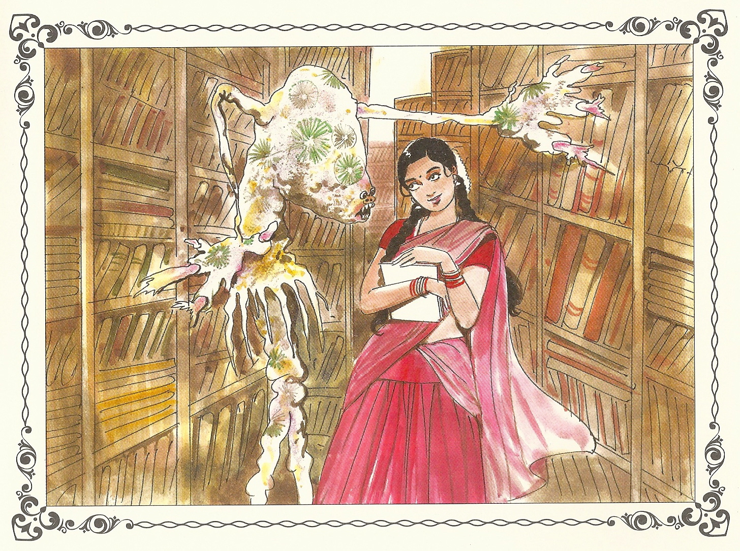 |
| A page from Blaft's Kumari Loves a Monster |
Tara Books
A love of Indian visual traditions is also
enshrined in the work of Tara Books, whose
originary question when they started out
in 1998 was, “Can different visual cultures
survive in a rapidly homogenising world?”
Since then, they have blazed a trail, working
with indigenous artists from Madhya Pradesh,
Gujarat and Bengal. They adapt artisanal
traditions of bookmaking – handmade paper
manufacturers, silkscreen printers and hand
binders – to produce handmade books
on an astounding scale. Tara’s innovative
design practice has created playful, stunning
books.
Whether it’s turning the vertical Patua scroll into a horizontal accordion book (The Enduring Ark [2013]), adapting Patua imagery into a Western-style panelled graphic narrative (Samhita Arni and Moyna Chitrakar’s Sita’s Ramayana [2011]), or even matching up the marvellous micros and macros of Gond artist Ram Singh Urveti’s imagination with a 17th- century English trick poem (I Saw a Peacock with a Fiery Tail [2012]) – Tara Books fuse the contemporary with the traditional. Their books travel to the US, the UK, Brazil and Mexico via handmade book collectives and children’s book publishers, reversing the usual flow of visual communication from west to east. “What we take from our immediate visual context, it goes all over the world,” says V Geetha, editorial director at Tara.
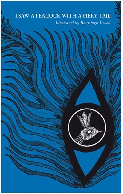 |
| The cover of I Saw a Peacock with a Fiery Tail |
Whether it’s turning the vertical Patua scroll into a horizontal accordion book (The Enduring Ark [2013]), adapting Patua imagery into a Western-style panelled graphic narrative (Samhita Arni and Moyna Chitrakar’s Sita’s Ramayana [2011]), or even matching up the marvellous micros and macros of Gond artist Ram Singh Urveti’s imagination with a 17th- century English trick poem (I Saw a Peacock with a Fiery Tail [2012]) – Tara Books fuse the contemporary with the traditional. Their books travel to the US, the UK, Brazil and Mexico via handmade book collectives and children’s book publishers, reversing the usual flow of visual communication from west to east. “What we take from our immediate visual context, it goes all over the world,” says V Geetha, editorial director at Tara.
Navayana
Also working with traditional Indian artists is Navayana. Its hard-hitting work on caste and marginalisation includes two visual books – A Gardener in the Wasteland (2011), a cheeky, unstintingly graphic interpretation of Jotiba Phule’s Gulamgiri, and Bhimayana (2011), in which Gond artists Durgabai and Subhash Vyam recreated experiences of untouchability from Bhimrao Ambedkar’s life. The ecology
of Gond art is filtered through the individual
readings of the Vyams and their textual
collaborators, Srividya Natarajan and Navayana
founder, S Anand, to create a work that
is unique and often profound. Traditional
digna floor patterns are used as page dividers
instead of panels, the thirsty young Bhim
is imagined as a fish, and when Ambedkar
finds himself homeless and takes shelter in a
park, he becomes the park.
Did you believe that reading takes time, and pictures can be looked at in a jiffy? But images can be more multifarious than text, unfurling new meanings with each reading. “You can spend two minutes with each panel in Bhimayana, or two hours. Or two days,” says Anand.
While one finger constantly hovers on the page down button, these are books that can make us hit pause. The picture speaks, and we cannot help but listen.
 |
| A page from Bhimayana |
Did you believe that reading takes time, and pictures can be looked at in a jiffy? But images can be more multifarious than text, unfurling new meanings with each reading. “You can spend two minutes with each panel in Bhimayana, or two hours. Or two days,” says Anand.
While one finger constantly hovers on the page down button, these are books that can make us hit pause. The picture speaks, and we cannot help but listen.
No comments:
Post a Comment